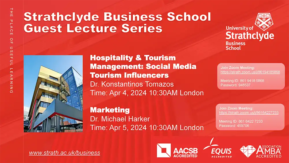
Online Guest Lectures by University of Strathclyde, Business School, UK
MUIC’s 38th Anniversary
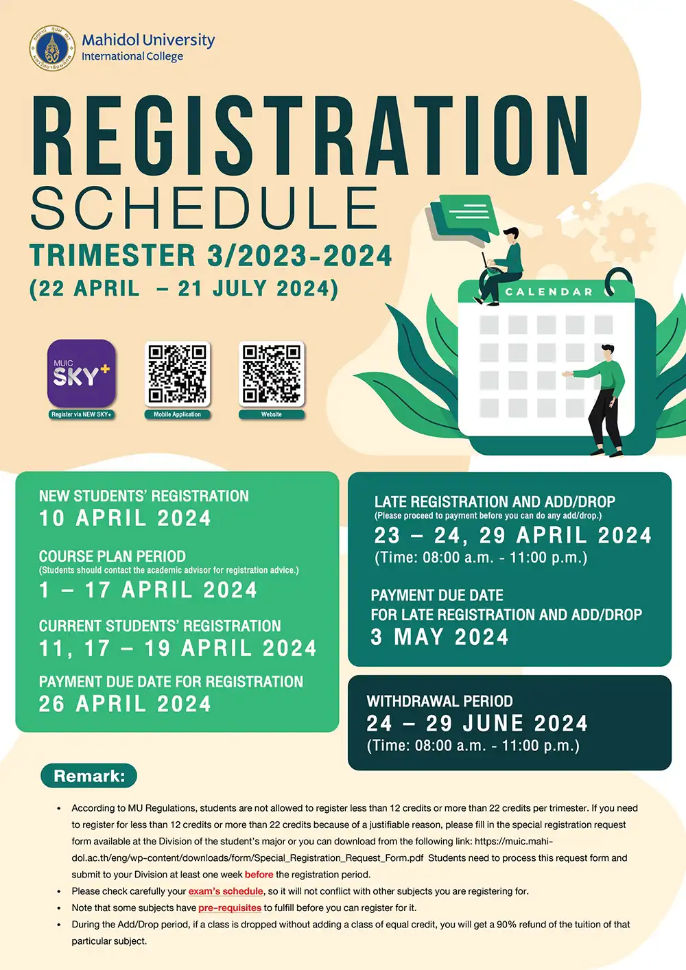
Registration Announcement for Trimester 3/2023 – 2024
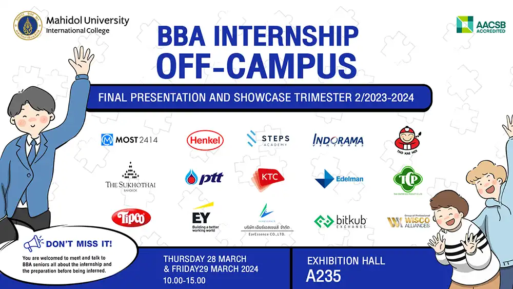
BBA INTERNSHIP OFF-CAMPUS
Diversity in The Digital Age for Education
September 19, 2022 2023-01-25 9:33Diversity in The Digital Age for Education

Title: Diversity in The Digital Age for Education
Date & Time: Monday, 19 September 2022 from 1.00 – 3.00 p.m.
Venue: Zoom Application
Conductor: Dr. Farida Virunhaphol, Design Consultant, Quality Alliance Thailand
The Strategy and Academic Development Section and the EdTech organized the online workshop entitled ‘Diversity in The Digital Age for Education’. The session aimed to introduce a quick tutorial of how to use Canva, help participants understand the fundamental principles of design to create aesthetically pleasing products, and design teaching and learning materials that can be used in the classroom.
The principle of design starts with a simple question ‘how do you make your work look good and professional?’. With technological advancement, several tools and platforms are developed to offer new opportunities to eliminate any creative constraints. Canva is one of the tools that provides thousands of templates to help users create professional designs without any design experience. To effectively use Canva, it begins with an analysis of your project to determine the essential words and phrases. Choosing elements to emphasize on your page depends on two major things; the content of the message and the essential part of the message. You then proceed to visually stress the vital information by appropriately adopting the principle of emphasis. This principle states that the essential element on the page should be the most prominent, the second most crucial element should be the second in prominence, and so on. Using emphasis in your pages simplifies the reader’s task and helps one pick important messages faster than wading through non-emphasized information. The techniques used to emphasize an element include:
- Making it the biggest
- Making it the boldest
- Making it the brightest
- Setting text in bold or italic or both
- Adding a unique visual effect to the element; for example, adding texture to it.
- Placing the element in a shape that is different from the other graphics/text on the page
- Adding a border to the shape around the element
- Silhouetting the image, if any
- Changing its color so it is different from other visual elements
- Using a contrasting color in it
- Surrounding the elements with lots of white space
- Adding a drop shadow
- Tilting it at an angle when other elements are horizontal
- Making it full intensity when everything around it is faded
- Making it bright if everything else is dull, or vice versa
- Positioning the item in the optical center of your page
- Positioning the item, so all of the other elements lead to or point toward it
- Making it sharp if everything else is out of focus, and vice versa
The second principle is concerned with contrast. It is one of the easiest, quickest ways to give the reader a visual treat and draw attention to the page. It’s used along with the principle of emphasis to avoid elements on the page looking too much alike and to pick up where the principle of emphasis stops visually organizing the page. Without emphasis and contrast, the page becomes blank, boring, and lacks a transparent organizational scheme. Creating the contrast styles, whether its color, background, text, or picture, is about making the targeted element visually stand out from other elements, for instance, by changing the color of the element/background, adjusting text style/size/pattern, and setting the hierarchy of information.
The next principle involves balancing the page layout. It speaks about the psychological aspects of humans, who usually are more comfortable with balanced designs and are more likely to stick around to read the page. This is simply due to the nature of ‘balanced design’ that makes the compositions look more pleasing to the eyes and creates stability and an organized look. Moreover, ‘balancing’ helps a lot when one wants to organize something repetitive, which is one of the design principles. Repetition is essential in all designs; it requires that the designer deliberately peruses and applies visual elements consistently to a page. With repetition, the pages will look more substantial and exciting; the robust design will imply sophisticated control of the page.
The last principle is unity and harmony. When a designer repeats some visual aspect of a design, the overall page looks more unified, and each separated element on the page looks as if they belong together. As the human eye seeks unity, readers will lose interest when no unity is found. In comparison, a unified design is easier to read, remember, and digest the message. It is essential in multiple-page publications such as a magazine or newsletters where a consistent look across many different pages holding different content is a must. Using repetition to achieve a unified design means repeating some visual aspects. Without harmonizing the color, themes, and fonts, people might feel confused, like there’s no continuity in the design. At the same time, it shows that the work is unprofessional and inconsistent.
The basic idea of design principles is mainly about what to do and what not to do. Understanding them can help you choose the right Canva for your work and decide what is beautiful and what is not, according to some design principles. Color, font style, theme, and text hierarchy can create a massive difference in learning and acquiring knowledge. Thus, by doing the right design, it will be aesthetically pleasing to the eyes of the readers and also become valuable learning material for the students.